 The results of the 2014 Eurovision Song Festival may be of interest from a number of perspectives, e.g. artistic, political and cultural. Here I will focus on the last point and show how by simple pattern recognition tools the cultural similarities between the participating countries can be analyzed. At the end it will be discussed the question whether Austria is the natural winner.
Representation
In the final round of the contest 26 songs have been judged by the peoples of 37 countries. A weighted voting system was used in which 1, 2 ,3, 4, 5, 6, 7, 8, 10 or 12 points had to be distributed over the best 10 songs of their choice. The remaining 16 songs received just 0 points. This constructs a set of 37 vectors in a 26 dimensional vector space. Every vector characterizes the preferences of the people of one of the voting European countries. Our assumption is now that there is a cultural similarity between two countries if their voting vectors are similar. Countries with with a very different cultural background are expected to be represented by very distant vectors.
A complicating aspect is that countries are not allowed to give points to their own song. Such a restriction only holds for the 26 countries with a song in the final round. A cultural very similar country with no song in this round does not have this restriction. I decided to correct this to some extend by changing the obligatory 0 points for the home country to 12 points, the maximum, assuming that its submission perfectly matches the cultural preference of the nation. This changes the lengths of just a part of the vectors. To correct for this, all vectors have been normalized to a unit length.
Visualization
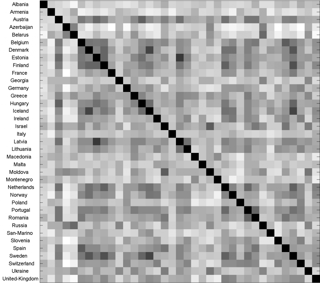
 As a distance measure the Hellinger distance is used as it shows a good performance in many applications with just positive vector components (e.g. for spectra and histograms). The resulting distance matrix is shown on the right. The dDistances between a country and itself is zero, of course. Small distances are dark, large ones are light.
The matrix as shown in this way is a mess and needs a further analysis. Before that, already some observations can be made. Some countries like Austria, Latvia and Sweden show many small distances:dark lines. They are similar to a lot of other countries. On the other hand, countries like Armenia and Italy show many larger distances and seem to be (very) different from most others
If we average all numbers in a row, the average distance of a country to all other countries will result. When they are sorted, countries in the center of the cloud of vectors will be on top and outliers, countries far away from everybody, will be at the bottom. The top of this ranking is given by:
Austria Sweden Estonia Portugal Latvia Netherlands Finland ….
and the end by:
… Malta Italy San-Marino Belarus Montenegro Albania Armenia Azerbaijan.
This ranking should be interpreted as that the first countries have many similar ones and that the countries at the end of the list have just a few.
An interesting table might be derived by by finding the nearest neighbor of every country in the space. These are the countries that pop up if the rows of the above table are sorted:
| Country | neighbor 1 | neighbor 2 | neighbor 3 | neighbor 4 | neighbor 5 |
| Albania | Switzerland | Israel | Romania | Montenegro | Spain |
| Armenia | Belarus | Russia | Macedonia | Poland | Georgia |
| Austria | Hungary | Estonia | Netherlands | Latvia | Portugal |
| Azerbaijan | Russia | Belarus | Moldova | Israel | Ukraine |
| Belarus | Russia | Azerbaijan | Greece | Moldova | Ukraine |
| Belgium | Spain | Denmark | Finland | Estonia | Sweden |
| Denmark | Iceland | Sweden | Finland | Netherlands | Norway |
| Estonia | Latvia | Finland | Austria | Hungary | Belgium |
| Finland | Sweden | Netherlands | Denmark | Estonia | Latvia |
| France | Sweden | Iceland | Netherlands | Germany | Norway |
| Georgia | Russia | Ukraine | Israel | Greece | Belarus |
| Germany | Switzerland | Sweden | Iceland | France | Poland |
| Greece | Portugal | Latvia | Hungary | Estonia | Ukraine |
| Hungary | Austria | Sweden | Iceland | Estonia | Netherlands |
| Iceland | Sweden | Denmark | Hungary | Netherlands | Norway |
| Ireland | Norway | Switzerland | Lithuania | Spain | Netherlands |
| Israel | Moldova | Spain | Romania | Ukraine | Austria |
| Italy | Austria | Hungary | United-Kingdom | Norway | Greece |
| Latvia | Estonia | Austria | Lithuania | Finland | Netherlands |
| Lithuania | Latvia | Portugal | Estonia | Switzerland | Ireland |
| Macedonia | Montenegro | Greece | Austria | Hungary | Portugal |
| Malta | Ireland | Israel | Netherlands | Romania | Portugal |
| Moldova | Israel | Ukraine | Azerbaijan | Russia | Belarus |
| Montenegro | Macedonia | Ukraine | Greece | Hungary | Austria |
| Netherlands | Sweden | Finland | Portugal | Denmark | Austria |
| Norway | Denmark | Iceland | Ireland | Sweden | Netherlands |
| Poland | Switzerland | Germany | Lithuania | Latvia | Estonia |
| Portugal | Romania | Netherlands | Sweden | Austria | Finland |
| Romania | Portugal | Austria | Spain | Israel | Belgium |
| Russia | Belarus | Azerbaijan | Georgia | Ukraine | Moldova |
| San-Marino | Iceland | Denmark | Sweden | Netherlands | Hungary |
| Slovenia | Switzerland | Lithuania | Portugal | Ireland | Norway |
| Spain | Belgium | Romania | Israel | Austria | Latvia |
| Sweden | Iceland | Finland | Denmark | Netherlands | Hungary |
| Switzerland | Slovenia | Ireland | Portugal | Germany | Poland |
| Ukraine | Moldova | Israel | Russia | Georgia | Greece |
| United-Kingdom | Netherlands | Finland | Norway | Switzerland | Iceland |
This table shows for every country the 5 countries that have voted in the most similar way. Some of the results are as to be expected, e.g. see Armenia, Finland or Russia. Others, like San-Marino are rather surprising. This might be caused by a small population and thereby a high noise level. Interesting are the mutual nearest neighbors that can be observed. These are the countries that are the nearest neighbor of their nearest neighbors, thereby constructing clear twins. Some of them can be directly understood, but are still striking that they are there, e.g. Sweden-Iceland, Russia-Belarus, Latvia-Estonia and Hungary-Austria. The connection Spain-Belgium, on the other hand, is far from obvious, at least for me.
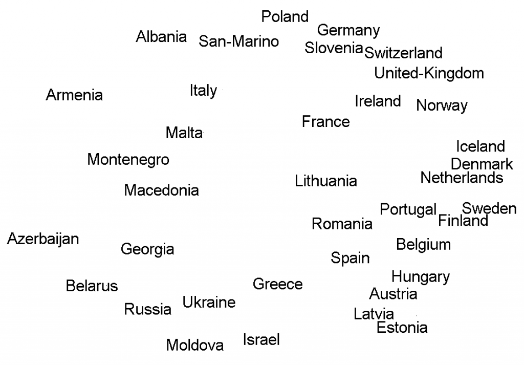
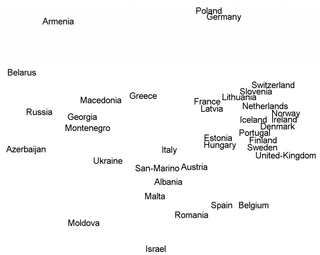
A drawback of the above analysis is that it considers the local neighborhood of every vector determined by the distance to always 5 neighbors. For high density areas this will be too small, for others too large. It might be better to create a picture. The vector space under consideration, however, is 26-dimensional. 2-dimensional scatterplots can be made, but have, obviously, strong limitations. Thereby it is definitely needed to use several procedures. Below two results are shown, one based on principal component analysis (PCA, left) and one on multi-dimensional scaling (MDS, right).
 Globally they are similar. It was needed to align the two plots by rotation as the MDS (right) is rotation invariant. Still there are some differences, e.g. the locations of Russia, Belarus and Greece. The two 2D projections both reflect just partially the multi-dimensional configurations. The PCA (left) is a linear projection that minimizes total error, roughly the sum of the differences between the visible and the true distances. So, some distances might be correct, others very wrong. The MDS is a non-linear procedure that minimizes the error expressed in the ratios between the visible and true distances. It thereby distributes the error more uniformly over all distances, avoiding very large ones.
Clustering
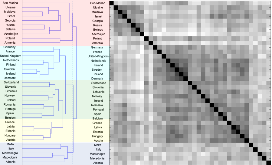
A procedure to visualize the original configuration in another way is by hierarchical clustering. It results in a dendrogram, a binary tree graph in which each node two clusters are merged, starting from the individual vectors and merging finally all in one big cluster. In each step the two clusters having the smallest distance are merged. In the complete linkage procedure that is presented below the distance between two clusters is defined as the distance between their two most remote vectors.
If the merging of clusters is stopped when just three clusters are left, there are two smaller ones (pink and dark blue) and one big one. In order to have more evenly sized clusters, the largest cluster is split again in three clusters (light blue, green and yellow) by considering its merging at a somewhat lower level. In this way five clusters are found:
- San-Marino, Ukraine, Moldova, Israel, Georgia, Russia, Belarus, Azerbaijan, Poland, Armenia
- Germany, France, United-Kingdom, Netherlands, Finland, Sweden, Iceland, Denmark
- Switzerland, Slovenia, Lithuania, Norway, Ireland, Romania, Portugal, Spain, Belgium
- Greece, Latvia, Estonia, Hungary, Austria
- Malta, Italy, Montenegro, Macedonia, Albania
Cluster 1 has clearly an East-European orientation, while cluster 2 contains many countries from West- and North- Europe. Cluster 5 is closely related to the Adriatic Sea. Cluster 3 is really a mixture of everything. I leave it to the sociologists and cultural anthropologists to draw further conclusions if any.
The result of the clustering has been used to reorder the list of countries. Reshuffling the rows and columns of the original distance matrix accordingly, results in a distance matrix as presented in the image on the right. Here the structure in the data is much better visible than in the original matrix above.
Questions
From this one-day project a few questions arise. First, how stable and significant are the relations and clusters that have been found? Results of other years need to be analyzed to answer this question. In addition, the tools and measures that have been used are chosen rather arbitrary: the Hellinger distance, the cluster analysis, the data visualization tools. Other ones might be considered.
Finally, is it by accident that the winner of the contest, Austria pops up as the most central country, because its average distance to all other participants is minimum? It is likely that the central person in a group, being best able to communicate with all others, will also be the most popular one. From that perspective Austria has won the competition because its culture, as defined here, is the most central in Europe. However, this conclusion has to be rejected, as it would imply that Austria will win (or end up close to that) every year, which is not true. Here we have a typical example of overtraining. As we define culture by the preferences in the contest, conclusions cannot be used for predicting results of the same contest.
Software
The Matlab m-file used in preparing this blog can be downloaded from here. It uses PRTools version 5.1.1.
Filed under: Applications • Representation


