 Are the evaluation results of the new procedure you worked on for months, worse or at most marginally better than the baseline procedure? Don’t worry, it happens all the time. Are they surprisingly good? Congratulations! You may write an interesting paper. But can you really understand why they are so good? Check, check, and double-check. Surprisingly good results are what they are: they surprise as it hardly ever happens. Here is one of our stories.
Readers of this blog will know that we are fond of dissimilarities, and especially the dissimilarity space. In some applications like spectra, standard distance measures offer good results without the need to define and measure good features or to optimize kernels. Almost any standard classifier can be used. In particular the linear support vector machine yields interesting results.
The flow-cytometry application
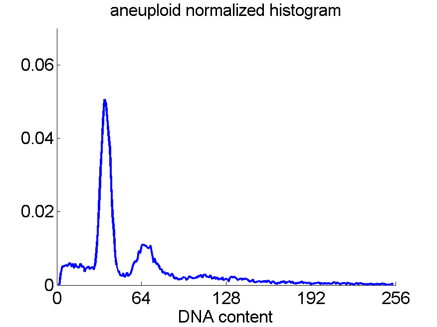
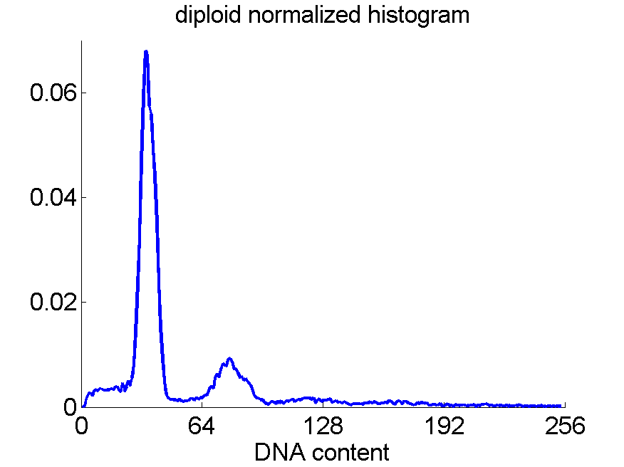
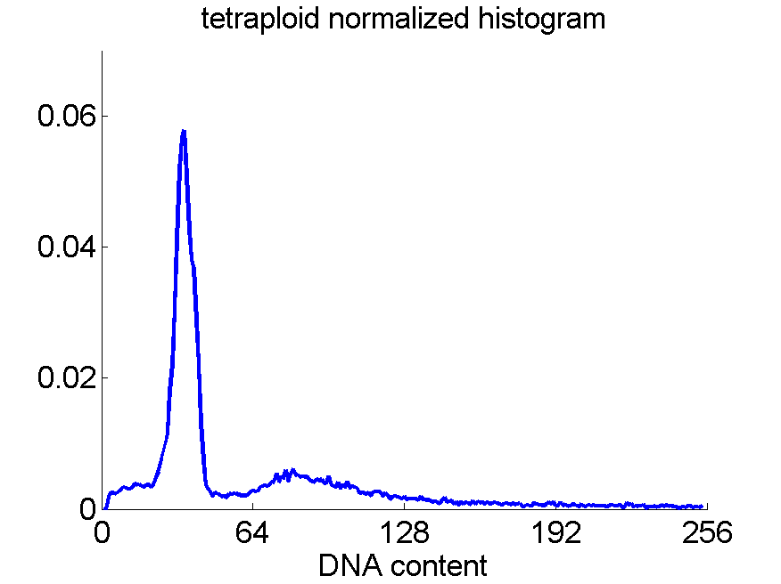
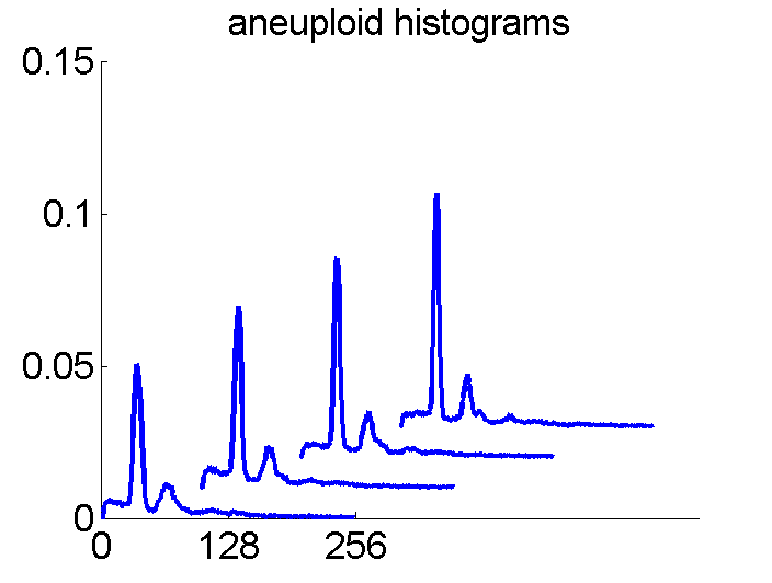
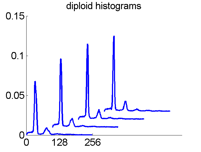
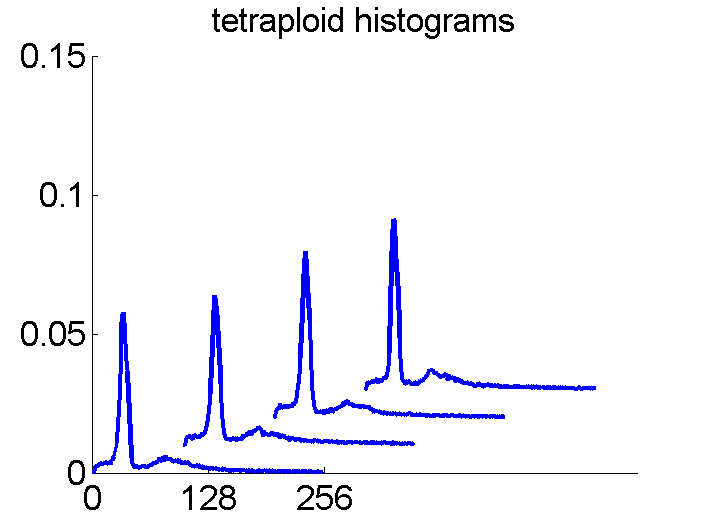
Consequently, in applications of the dissimilarity representation the emphasis may be laid on optimizing the distance measure. There is a lot of freedom in the design as non-Euclidean and even non-metric measures are allowed. One of the applications we studied was on flow-cytometry histograms, a cooperation with Marius Nap and Nick van Rodijnen of the Atrium Medical Center in Heerlen, The Netherlands. In a breath cancer study (around 2005) we analyzed four datasets of 612 histograms with a resolution 256 bins. The four datasets were based on four different tubes of about 20000 cells of the same 612 patients. The histograms show the DNA content estimates of the individual cells. The patients were hand labeled on the basis of the histograms in three different classes, aneuploid (335 patients), diploid (131) and tetraploid (146). Here are some examples.
Standard feature based procedures use positions, widths and heights of the peaks. Straightforward sampling of the histograms, or just using the 256 bins directly cause problems. Due to settings of the flow-cytometer, measurements made on different moments in time or on different days, might not be exactly calibrated. For that reason we decided to use a pair-wise calibration followed by measuring the L1 distance between all 612×612 pairs of histograms in each of the four datasets.
Dissimilarity space classification
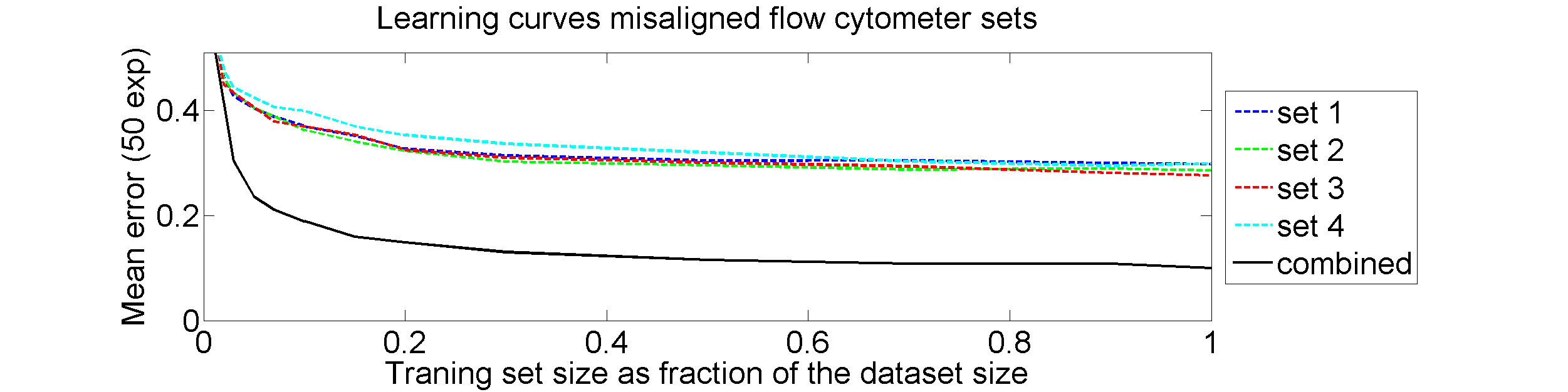
From each of the four 612×612 dissimilarity matrices we computed a learning curve. The objects were repeatedly split in a subset T for training and S for testing. The matrix D(T,T) was interpreted as |T| objects in a dissimilarity space of dimensionality |T|. By LibSVM a linear support vector classifier was computed and tested by the |S| objects represented by D(S,T) in the dissimilarity space. This was repeated for various sizes of T and for each size 50 times with different splitsT and S. The results for the four datasets as well as for an average of these datasets is shown below.
Surprisingly good results!
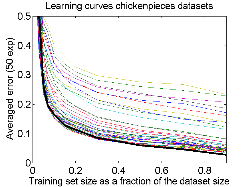 The results for the four sets are very similar, but the result of the averaged dataset appeared to be spectacularly better. For various other problems averaging of different dissimilarity measures for the same objects also appeared to yield significant results, but not as strong as the ones above. An example is given on the right. Averaging 44 dissimilarity matrices (the thick black curve) of the five-class Chickenpieces dataset is slightly better than the best individual result using the linear LibSVM classifier. This is good news as averaging is much more simple than cross-validating 44 procedures.
A difference with the flow-cytometry application is that for the Chickenpieces different measures on the same measurements are averaged, instead of repeated measurements on the same patients. In the latter case really different information might be obtained (albeit from the same biopsies) as the four tubes used in a flow-cytometer resulting in the four datasets are physically processed in slightly different ways to obtain estimates of the cell DNA contents.
Doubts
The pathologists in our team had there doubts. Classification results of 10% error are much better than they could imagine.We checked and rechecked our experiments. Different classifiers and combining procedures always obtained a significant improvement after combining the four sets. In some papers and presentations on the dissimilarity representation the flow-cytometer application was used as an illustration of possibilities.
After some years we published an overview of various results from different applications, including the above figure and discussed whether a paper in a medical journal would be proper. So again,we carefully checked the entire procedure. We collected some examples of histograms for the same patient, based on the same biopsies, but analyzed through different tubes and ending up in the four datasets. Examples like the following were found.
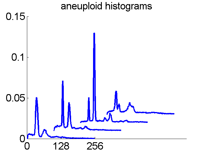
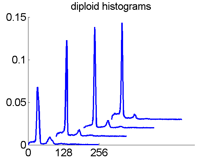
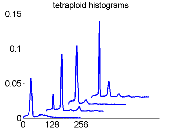
For the data analysts in the team this proved the point: The four histograms are really different and so combining makes sense. For the pathologists, however, it was very clear that there was something very wrong. The four histograms could never be so different. Now we returned to the CD that was used years before to exchange the data between the hospital and the university.
Correction
The CD contained the the four datasets in a raw format. The data were organized in these sets in identical ways, first the aneuploids, then the diploids and finally the tetraploids. The datasets had been copied to the university servers. The CD, however, contained more information, among which the patient numbers. They had been discarded in the data analysis and were replaced by an object number corresponding to their position in the dataset, to protect the patient privacy. This is a second security level and not really needed as the relation between patient numbers and patient identity is only known by the hospital.
After comparing the patient numbers with object numbers, it appeared that, in spite of the same class orders, they were different for the four datasets! Presumably this was caused by a randomized recognition experiment in the hospital, where combining datasets was never considered. After aligning the datasets according to patient numbers, histogram correspondences like the following were obtained:
The four flow-cytometer histograms obtained from the same patient are now very similar. There are just small differences related to noise and slightly different measurement procedures. We still had some hope that combining could be helpful, but after repeating the above experiment the following learning curves were obtained
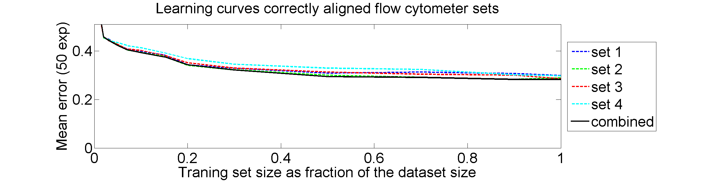
The four datasets are so similar that combining them as we did (averaging pairwise calibrated dissimilarities) hardly improves the classification. May be better procedures are possible, but we didn’t find them yet.
Understanding the incorrect good results
Why does randomizing the object order inside the classes yield so good results? When a training object is combined with another object of the same class then on the average, in expectation, the result shifts into the direction of the class average. The training sets become better separable in this way. In the way this was done by us accidentally, training and test objects where combined. Consequently, the better class separability holds for the test set as well. Or, in short, information about the training set and the test set was combined, including label information.
Last words
We feel unhappy with the fact that we published incorrect results, albeit as an illustration (among others) of a procedure that is otherwise without problems. This post serves partly as a correction, but mainly as a report and a warning for students and starting colleagues on how things can go wrong. Don’t be too happy with great surprises!

Filed under: Applications • Classification • Representation